Wednesday, July 29, 2009

Me, Myself and I

These are the images that i will be using for my me myself and i composite. The idea behind it is a back yard circus where i will place myself 10 times in the image of my backyard doing 10 various stunts.


Wednesday, June 10, 2009

Rolls Royce


What elements of the company contribute to its image as far as the public is concerned?
There are many things that contribute to Rolls Royce’s image such as reputation, money, packaging/looks, marketing, location and their target market. All of these things combined give the Rolls Royce an elite image of pure sleek and sophistication. In the following paragraphs I will break down the above mentioned factors and give detailed explanations of how they each contribute to the image that is Rolls Royce.
Reputation
Everybody knows that a Rolls Royce is a car driven by people with money. From the moment of our birth we are taught what is cheap and crappy and what is schmick and sophisticated, the Rolls Royce being in the second of those options. The mere fact that a man drives a Rolls Royce shows that he must be rich and powerful because only these types of people drive these cars. And then of course this man will go play golf with his fellow country club members and tell them all about the most divine new car he just purchased and then they to will most likely go buy one and tell their friends and so on and so forth.
Packaging/looks
Unlike a lot of today’s cars the Rolls Royce has a very distinct look that is like no other car. A lot of the cars on the market today’s are very similar in design or features, but there is no other car out there that mimics the exterior superiority of the Rolls Royce. Then there is of course the one thing that tells a Rolls car apart from the rest, its mascot “the spirit of ecstasy” which is found on the bonnet of every Rolls Royce car today, however not on the early models such as the first vehicle made in 1905. As well as cars Rolls also make engines for aircraft such as the Rolls-Royce Trent 1000 engine which is designed for the Boeing 787 dreamliner, I’m however just gonna focus on the car side of their enterprises.
Marketing
In the consumer industry marketing is everything, if you don’t market your product how will the consumers know it’s out there? When it comes to Rolls Royce marketing they seem to take the less is more approach. Maybe there is method to this or maybe it’s just out of pure arrogance but hey if I were Rolls Royce I’d be pretty arrogant to. When you’re sitting down watching telly with your family or by yourself with a beer whichever floats your boat, you are usually inundated with motor vehicle advertisements, but are any of these ads for a Rolls Royce motor vehicle?? The answer my friend is no, no they are not because when it comes to marketing Rolls rely on minimal advertisements and a lot on word of mouth or the above mentioned “reputation” because lets face it if your sitting down watching prime time telly then there’s a very good chance you ain’t gonna be able to afford A Rolls so why would they waste perfectly good money on advertising to a market that can’t afford them when they could spend it on drugs and hookers?
Location
Unlike your average everyday run of the mill ford or Holden dealer, a Rolls Royce dealer cannot simply be found anywhere. While Rolls have firm UK roots they are a global company and have manufacturing bases in 20 countries. In Australia a Rolls Royce dealer can be found mostly in city locations but other car dealer can act as Rolls dealers and stuff like that.
Target Market
First off lets define the term “target market”, It means in my words the demographic of people that a products maker will aim to sell the product to. If I haven’t made it obvious already the target market for Rolls Royce are rich and sophisticated people. The reason for this being that these are the types of people who will be able to afford their product.
Money
It’s a well known fact that Rolls Royce vehicles are not cheap. To own one means you must have money. In fact I would go as far as to say that a big part of Rolls Royce image is due to the money aspect. All of the points I am making seem to tie in with money one way or another. Ok lets break it down, Rolls have a “reputation” for being expensive cars that can not be afforded by the average Joe, they are “packaged” to reflect this reputation, they are “marketed” as a car for those with money to those with money meaning that as mentioned Rolls don’t advertise to the lower class people, “location”...ok yeah I can’t really think of how that fits in but I’m sure it probably does and then there’s “target market” which is as mentioned those with money.

Gps- due day

Today is the due day of the gps packaging assignment that i have been working on. Overall i am pretty happy with how it has turned out. Throughout the process i had a few problems to face and made quite a few changes on the advice of my teacher which i feel greatly improved the design. Over the last monthish i have worked my absolute hardest on this project to try and make it as perfect as i possibly could. I have printed several times because if i noticed the slightest problem i had to fix it so i have quite a few constructed boxes laying around my room! needless to say i am now a pro at putting boxes together! haha. I feel like my design has come a long way since the first rough sketches i made and i'm quite pleased with how it has turned out. I am now almost finished except for having to re-print and construct again due to some slight problems that needed to be rectified. I'm not sure if we will have any class time today to do this so i'm planning to go in at lunch and do it just incase. In summary i feel like i have done all i can to make this project the best i could and feel there is no more i could have possibly done to make it any better.

gps- bottom half of packaging


Because my overall box size was slightly too large to fit on an A3 page, i divided my box into two parts the top and bottom half which when printed i glue together at the bottom and it makes a whole. I had the same issues with this half as i did with the top half but as mentioned i fixed those problems and all is peachy!

gps- top half of digital packaging


This is the digital version of my navpro packaging. It is pretty much the completed version except for a few small things that i noticed while constructing that needed fixing. These things where the stroke sizes on my shrunken images, although while large it looked fne what i didnt notice was that when i shrunk my device the stroke became to thick on some things and made them unrecognisable. So i went through and fixed that aswell as moving a few things in a little because they were a bit too close to the edge once printed. I also noticed while constructing that the edges of the box didnt quite fit together very well, so i used the printed constructed box i had to image what way i needed to alter the image on the screen to help it better fit together.

Saturday, June 6, 2009

Gps- my own device


This is the Navpro G2-88 device that i drew in illustrator. The reason i drew my own device and not simply used a stock image is because the stock image i chose printed terribly and luke suggested i draw my own so i did.

Gps analog box bottom


This is the bottom of my Analog version.

Gps analog box side 2


This is the right side of my Analog version.

Gps analog box side 1


This is the left side of my Analog version.

Gps analog box back


This is the back of my Analog version.

Gps analog box front


This quite obviously is the front of my Analog version.

gps- sketch 4 finished analog design


This is the completed and more detailed rough design. it features everything that was to be on the packaging at this stage of progress.

gps-sketch3 rough box design


This is the first design i did of the box as a whole. It is mostly just boxes with what will be in the boxes written inside. The main point of this was to get an idea for the layout and decide where everything was going to go and how it would all fit together.

gps-sketch 2 logo ideas


Once i had decided on the name i began to play around with some logo ideas. I had a rough idea on the sort of logo i wanted so i just played around with some different shapes before settling on the oval. I also had initially thought of calling it the navpro 3000, but thought that sounded a little cheesy so went with G2-88 instead. The way i came up with G2-88 is that the G2 is an abbreviation for get to and 88 is the year i was born.

gps-sketch 1 name ideas

This is a photo of my page of name ideas. Some of them are quite stupid but i thought it best to put down everything that came into my head.

Sunday, May 31, 2009

GPS- overall design process

The way in which i came up with my box design
once i had created my rough logo and decided on my colour scheme i did some brief research on other gps boxes and chose certain elements from a few of the boxes that i liked and then added some of my own elements. I then put all this together on my box template and created my analog version. In class though luke gave a a brief lesson on what is a common design with gps boxes and what should be featured and where, so i made several changes in the digital version, for example in the begininig i only had my gps device image featured once on the front but now have it on mostly all sides.

GPS logo- final product


Here is the final product of my navpro logo. The changes i've made this time are i've swapped the colour's around and made the font larger so it takes up more of the shapes.

Wednesday, May 27, 2009

GPS update


This is the new version of my logo. It was bought to my attention that the old logo was a little to playful for the product so i simplified it to make it look more corporate and profesional. The main things i did was flatten it out and remove the gradient, glow and shadow and changed the font from rounded to square.

Wednesday, May 20, 2009

GPS update

For the last couple of days i've been creating my analog version of the packaging. I find this part to be my most challenging of the entire process due to my limited drawing abilities. I have chosen to use mostly texta to render the box with the occassional pencil here or there, the reason for this is it will best achieve the look i am going for. As predicted i am struggling a little though i am paying great attention to the details and putting in alot of effort which will hopefully give me a half decent result.

Wednesday, May 13, 2009

illustrator me


This is a picture of me which i vectored in illustrator

untitled


This is just something i created in illustrator in my spare time.

food for thought


This is also a piece created for an assessment the same as the previous post. This one is displaying the common things on the average humans brain.

unfair society


This is a work i created for an assessment where we had to imitate a style of a chosen design studio. The meaning behind it is that society has unfair expectations on young girls and conveys unatainable goals to them.

falling tears


This is just something i put together one night for the hell of it, i've been messing around in photoshop and illustrator a fair bit and i came up with this idea so i made it.

indirect impact


This is a peice i created for an art comp that luke wanted us to enter, unfortunatly i forgot about it till a few days before it closed but stayed up all night and made this. The idea behind it is pretty obvious its about the affect that war has on kids.

Tuesday, May 12, 2009

GPS- my design process

When i design a product that requires a brand and or logo i follow the following process
1. I come up with the name, in my diary i sketch down dozens of names until i get one that jumps out at me and suits the product.
2. i design the logo, i take the name i came up with in step 1 and design dozens of different logos until i get one that i am happy with, i then decide on the colours i want to use that will compliment my logo.
3. I research other packaging of the same product and gather what important information needs to be on the packaging and the type of designs they use.
4. I take all my research and build a complete box around the logo and colour scheme.

Sunday, May 10, 2009

GPS

During class today i completed the following
* Digitally rendered my logo.
* Researched GPS systems and their packaging.
*Selected my box design.
*made a rough copy of my packaging in pencil.

My GPS logo


During class we have been given an assessment to design and create a GPS box. We have to come up with the name, model number and logo then use them in a complete box design. This right here is my logo for the NavPro G2-88 the best damn GPS this side of....... Ashmont.

Monday, March 2, 2009

Colour Psychology


Red
In western society the symbolism of red is Passion, strength, energy, fire, love, sex, excitement, speed, heat, arrogance, ambition, leadership, masculinity, power, danger, gaudiness, blood, war, anger, revolution, radicalism, socialism, communism, aggression, summer, autumn, stop, Mars (planet) and respect.
Red is also the color of the devil in modern Western culture.
It also represents hunger.


Orange
The symbolism of orange is happiness energy, balance, heat, fire, enthusiasm, flamboyance, playfulness, aggression, arrogance, gaudiness, over emotion, warning, danger, autumn and desire, orange has less intensity or aggression than red and is calmed by the cheerfulness of yellow.


Yellow
The symbolism of yellow is sunlight, joy, happiness, earth, optimism, intelligence, idealism, wealth (gold), summer, hope, air, liberalism, cowardice, illness (quarantine), fear, hazards, dishonesty, weakness, greed, femininity, gladness, sociability, summer and friendship. Yellow evokes feelings of happiness but when we are confronted with too much yellow, we become annoyed or angered. Yellow like red can also represent hunger.


Purple
The symbolism of purple is nobility, envy, Sensuality, bisexuality, spirituality, creativity, wealth, ceremony, mystery, wisdom, royalty, enlightenment, arrogance, flamboyance, gaudiness, mourning, profanity, exaggeration, confusion and pride.


Green
The symbolism of green is great intelligence, nature, spring, fertility, youth, environment, wealth, money (US), good luck, vigor, generosity, go, grass, aggression, coldness, jealousy, illness, greed, Marijuana and drug culture(hippies) , life eternal, air and sincerity. Green is believed to be the luckiest of colors in some western countries including, Britain, Ireland, and the U.S


Pink
The symbolism of pink is spring, gratitude, appreciation, admiration, sympathy, homosexuality, kittens, muffins, Paint, femininity, health, love, sex, June, marriage and joy. Pink is the sister of red, but could not be more different than if they were complimentary. Pink is also a tranquilizing colour and symbolizes innocence and child like flirtatiousness.


Blue
The symbolism of blue is Seas, men, skies, peace, unity, harmony, tranquility, calmness, trust, coolness, confidence, conservatism, water, ice, loyalty, dependability, cleanliness, technology, winter, depression, coldness, idealism, obscenity, tackiness, sex, air, wisdom, royalty and nobility. Many police uniforms are blue because the color says confident, security, while being non-threatening.


Black
The symbolism for black is absence, modernity, power, sophistication, formality, elegance, wealth, mystery, style, evil, death (Western cultures), fear, seriousness, conventionality, rebellion, anarchism, unity and sorrow. Black is a multi-dimensional color that can mean classic or new.


White
The symbolism of white is light, reverence, purity, truth, snow, peace, innocence, cleanliness, simplicity, security, humility, sterility, winter, coldness, sex, criticism, surrender, cowardice, fearfulness, unimaginative, air and marriage. White is also associated with neutrality—hence a white flag for surrender.


Gold
In society we associate gold with value, which is exactly what is triggered when we see it in marketing materials although it can seldom be used in marketing materials because the colour usually isn't duplicated well. Gold in western society also represent expensive and prestige. Gold is also the colour of wedding bands and all things that are expressions of spiritual illumination (halos), eternity and precious bonds.


Brown
The symbolism of brown is calm, boldness, depth, natural organisms, nature, stability, tradition, fascism, boorishness, dirt, feces, dullness, filth, heaviness, poverty and roughness.


Grey
The symbolism for Grey is elegance, humility, respect, reverence, stability, subtlety, wisdom, old age, boredom, decay, dullness, dust, entanglement, pollution, urban sprawl, strong emotions, balance, neutrality, mourning and formality. Grey is somewhere between white (good) and black (evil) and is a blasé colour.


Maroon
Maroon in society is considered a cool colour the characteristics are understated elegance, cool, calm poise, graceful, up market, timeless, expensive, soothing, and aspirational. Negative aspects of maroon are that it may be interpreted as draining, unfriendly, aloof, elitist, and 'wishy-washy'.


Silver
In society silver also represents prestige just like gold. It sends signals of cold or scientific. This is why silver is used so much for kitchen appliances. It also represents cleanness in some instances, especially kitchens. Silver is also balancing, harmonizing and sensitive.

Thursday, February 26, 2009

typography art no 3


This is my third attempt at the type art. I think out of the 3 this is my favourite. It’s a garden scene with the sun and flowers and a bee and butterfly. I have no idea where the inspiration came form I just sat at my computer and kept designing until I got one I liked! I’m starting to really see now the things Nathan told me last year especially that your first idea or piece of work isn’t always your best, so keeping that in mind I kept creating even after the first piece to try and better my work.

typography art no 2


This here is my second attempt at making art using type. It’s meant to be a palm like tree, it took me probably the longest to make yet I think looks the worst! Again just for something different the idea in my head failed to produce itself on the page! I think it’s my biggest challenge and was very noticeable last year, I have good concepts and ideas but are lacking in the skills to get them down visually which is something I’m hoping that doing this course will help me with.

typography art no 1


In class we have began to learn how to make artwork using only type and we were asked to create a peices of art using nothing but typography ourselves. This one here is my first attempt at that task. The reasoning behind this piece is i wanted to make an artwork that represented myself in some way so i chose to do it part black and white as i am if only a small amount part black which is a side of me i feel strongly about. I chose to use the letters k and s as these are my initials and further incorporate myself into the piece. I wasn't overly happy with the end product, as usual i had an idea in my head but it didnt turn out as i imagined but then nothing i do ever does!

Monday, February 23, 2009

Basic roles that make up a design agency

Art Director
The Art director is the person responsible for creating ad visuals, the person who comes up with the concepts. Graphic designers may create the piece but the Art director is the person in charge of the design and is the person who tells them what to create. Usually Art directors have a bachelor or masters degree in fine art and are highly trained in graphic design. The Art director is the person in charge of the visual look of the message that the client wants to portray. To be specific the Art director makes the decisions on whether to use art or photography in print, film or animation in television and what type of artistic style to use. The main duties of an Art director are to talk to clients throughout the creation stage to gain their approval, provide leadership, motivation and mentoring to other creative staff, manage and drive the creative development of advertising, promotional and communication projects and to manage and direct outside creative resources as needed. An art director works indoors, usually in modern offices. The hours they work are highly irregular and will depend on their current assignments. The personal requirements that you need to poses to be an Art director are to have artistic ability, creativity, to be energetic and highly motivated, have good written and oral communication skills, be able to work under pressure, to have good organization skills and to have problem solving skills. The Art director is also the highest paid person in the studio. The average wage for an Art director is around $80,000 a year how ever they can earn up to $150,000 depending on the company, area and their skills. Some famous or well known Art directors are John Kosh (creative director for the Beatles Abbey road album), Neville Brody (A well known Art director for many magazines and album covers) and Claude Marchand (Art director for film).


Creative Director
A Creative director is a position usually found in the advertising, media or entertainment industries, but can also be useful in web development and software development. The duties of this job are overseeing the design of branding and advertising for a client and making sure it fits with the client’s requirements and the image they wish to portray for their company or product. To be more specific the main aspects are a client’s wants and needs and then develop a creative approach that fits with the specified wants and needs. Another role of the Creative director is to initiate creative ideas and motivate the other designers involved in the creative process to produce their own creative ideas. Creative directors normally oversee creative service agencies or departments within a corporation. Ultimately the Creative designer is responsible for the quality of the final work. This means that the Creative director gets the most appraisal for a successful job but on the flip side they also shoulder the brunt of the blame for a failed one. There is no real qualification that a creative director needs, but there are specific things you need to posses to be a successful Creative director. A main skill needed is to have a good handle on and knowledge of the technical aspects of the business because this helps to solve problems that many prevent the product from being completed. The average salary for a Creative director is around $90,000 per year but can be considerably more depending on the company, are and skills possessed. Some famous or well known Creative directors are Peter Saville (Creative director of Manchester) and Roger Paul Mosconi (an award winning Creative director).
Senior Graphic Designer
A senior Graphic designer is the next position down from the Creative Director. As the title suggests they are in charge of the designing and handling of the junior designers under them. To become a senior graphic designer you need to have several years experience in the design industry, expert knowledge of the programs used in design specifically the Adobe master suite and you need to have excellent leader skills. Senior Graphic designers should be adept at taking briefs and will more than likely have some client liaison experience. As a Senior Graphic designer you need to have excellent problem solving skills as you are in charge of the design team. The roles of a Senior Graphic designer tend to include being the main illustrator for the concept, work closely with the Creative and Art director during the design process and being responsible for the team meeting its deadline. The average wage for a Senior Graphic designer is $50,000 to $60,000 per year. Most Creative and Art directors would have more than likely been Senior Graphic designers at some point in their career.
Junior Graphic Designer
A junior graphic designer is the first position you will get when finished studying. Everybody knows that when you begin a career you need to start at the bottom and for the design industry junior graphic designer is that place. In essence a junior graphic designer is the bottom of the food chain and the position that will require you to have the least amount of experience. Sometimes companies may offer junior graphic designer positions to people who are still studying to give them industry experience while they’re learning. The average length of time for a person to remain a junior graphic designer is around two year but it varies from person to person. The roles of the Junior Graphic designer are to layout pages, draw logos, redraw logos, do text corrections and generally all the stuff that the senior graphic designer doesn’t want to do. In a way you could say that junior graphic designers are apprentices and therefore get the wage and jobs in accordance. The average wage for a junior graphic designer is around $35,000 to $42,000 a year depending mostly on location.
Web Designer/developer
Most design studios now a days offer websites as part of their services. A web designer or developer is sometimes referred to in the industry as a “code monkey” because they work with code to build the sites. A web designer or developers role is as the title suggests to design and or develop websites. Almost all companies and businesses have websites these days and it’s the code monkey’s job to make these sites. The type of general skill you would need to be a web designer/developer would be a strong knowledge of html code because you can’t always rely on the programs to be right, the knowledge of what style of design would suit what website because certain sites will have different looks, for example a bank website wouldn’t need to be fancy and contain flash content where as a animation companies site would instead of the plain and simple that would fit the bank. Web designers and developers also need to have a creative flair given that they are still designers even though it’s a bit different from the type of design a graphic designer would prominently do. The average wage for a web designer/ developer depends on many different things, firstly their experience and level of productivity and secondly if they charge per project, by the hour or are hired by an agency for a set amount. Given the other wages you can expect to receive in the deign industry a rough estimation of around between $50,000 to $100,000 would be a fair assumption.

RMG

1. Where are they?
Wagga Wagga NSW
2. How many staff?
RMG have 11 staff members.

3. What are staff roles?
The roles of the staff vary from advertising to marketing and designing.
4. What type of design?
RMG do all types of design, you name it they most likely do it. Some of these include logos, magazines, books, websites and TV commercials.

5. What is their work made of?
Due to the variation in the type of designs they do RMG’s work is made up from all types of mediums. They have digitally created works, print works and they also do interior and industrial design which would use everyday objects like metal and wood.
6. Who are there major clients?
They have a lot of clients but their main clientele is made up from local businesses in the Wagga Wagga area.
My 5 favourite designs
http://www.rmgdesignstudio.com.au/flash/index.asp
identity- Malebo milk logo
website- lynvetlynk.com.au
ads- little big day out
features- The daily advertiser
- Inland NSW tourism awards 2006

Friday, February 20, 2009

Limelight Design studio

1. Where are they?
Melbourne VIC
2. How many staff?
The amount of staff was not stated on the site however given the amount of services they provide and the fact that they are on of Melbourne’s leading design studios I would estimate that they would have at least 10+ employees.
3. What are staff roles?
Some sorts of roles that are found at Limelight are graphic designer, website designer, programmer and photographer. The founder and creator of Limelight is Helen Mclean, she started the studio in 1998 she herself is a graphic/Web designer as well as an artist/photographer.

4. What type of design?
The type of design that limelight do is very varied. They do all of the following
Extensive web design & web development
Website Content Management Systems
Regular website maintenance
Website hosting and Domain Name registration
Multimedia Flash presentations & animations
DVD photo albums
Commercial photography
Logo branding design
Graphic & print design
Business cards
Customized websites

5. What is their work made of?
Out of all the agencies I have researched limelight has the most varied mediums. They have digitally created work, photography, oil paintings and analogue works.

6. Who are there major clients?
Like HipFish their major clients are not defined but some of their clientele include Laura Licious, Newport Lakes, Hobsons Bay Community Arts Centre and the International Social Service, Australian branch


My five favourite designs


both the Heidi Van Horne & Velvet Kitten and the two tiki paintings
My favourite is the Lithos Therapy brochure

HipFish Design Studio

1. Where are they?
Mackay QLD
2. How many staff?
The exact amount of staff wasn’t specified however through some extensive digging I found that there are at least 3 and that they have recently expanded their team to provide a more rounded service.

3. What are staff roles?
The three members of staff I was able to find were, business development officer, Joel Cox, advertising/marketing specialist Lyn Yaworsky and designer Zoe-Claire Yaworsky.
4. What type of design?
HipFish are a marketing, branding, Graphic design and web Development Company. They describe their type of designing as clean, clear, concise and dynamic and that they offer a rounded service to suit the needs of any type of business.

5. What is their work made of?
HipFish’s work is made from all kinds of mediums. They have digital works like websites and logo’s, they also use a lot of photographs in their works. They do signage for companies some of which are vinyl banners and they also have some analogue works to.
6. Who are there major clients?
The site didn’t specify who were its major clients but some of their clients are The Ambassador hotel, Fusion Apartments, Wesley clothing and Ziggy’s engineering.
My five favourite designs
http://www.hipfish.com.au/portfolio/graphicdesign/poster_1.php

http://www.hipfish.com.au/portfolio/logo/logo_3.php

http://www.hipfish.com.au/portfolio/signage/signage_bluewater.php

http://www.hipfish.com.au/portfolio/website/web_krystal.php

http://www.hipfish.com.au/portfolio/website/web_nqc.php

Bullseye Design studio

1. Where are they?
Bullseye have offices in Spring Hill Qld, Melbourne Vic and North Sydney NSW
2. How many staff?
Bullseye have over 85 staff some of them are, Jim Mckerlie, Greg Muller, Jason Davey, Emily Birch, Martyn Toney, Kerry Lacy, Mark Nicklin, Rosemary Black, Kevin Ferry, Pedro Da Palma Rosa, Craig Compton, Ron Hawkins, Gillian Inglis, Ian Farmer and Catherine Eddy.
3. What are the staff roles?
The roles of the people mentioned above are, Jim Mckerlie CEO, Greg Muller MD and Director- digital strategy, Jason Davey Director- digital marketing, Emily Birch NSW operations director, Martyn Toney Director- Technology and development, Kerry Lacy Vic operations director, Mark Nicklin Director- digital experience design, Rosemary Black QLD operations director, Kevin Ferry Creative Director, Pedro Da Palma Rosa Director- intellectual capital solutions, Craig Compton technical director, Ron Hawkins Human resource Manager, Gillian Inglis National marketing Manager, Ian Farmer Brand strategist and Catherine Eddy Finance Director.
4. What type of design?
Bullseye are a digital service agency so the type of work they do are online advertising and interactive type designs.
5. What is their work made of?
Like Amnesia all of Bullseyes work is digitally created.
6. Who are their major clients?
Major clients of Bullseye include Mazda, Coke, Sensis and channel 10
My five favourite designs
http://www.bullseye.com.au/
I am unable to access any of the images in a transferable manner so I have provided the link to the home page and will list the 5 designs from that page that I liked the most.
1. The Mazda RX-8 page
2. The David Jones page
3. The great Australian salary survey
4. NyleX
5. Village (57 I think)

Amnesia Design studio

1. Where are they?
Amnesia have offices located in Sydney Australia and Tokyo Japan.
2. How many staff?
Amnesia Razorfish is part of one of the largest interactive agencies in the world and currently has more than 2,000 employees in 20 offices in seven countries (Australia, China, France, Germany, Japan, the United Kingdom and the United States)
3. What are the staff roles?
There are too many roles involved with the day to day running of such a large company to list however some of the roles of the staff at Amnesia include the management and leaders, the designers, the creators and sectarian position.
4. What type of design?
Amnesia razorfish is a digital agency so they specialize in things like website development and online advertising.
5. What is their work made of?
Since Razorfish is a digital agency all of their work is digitally created. They use a combination of photography and digital art both of which are often presented in an interactive manner. However not all is interactive as some of the work they do are album covers and design i.e. the ministry of sound both the website and album cover were designed by Amnesia.
6. Who are there major client?
Amnesia have many high profile clients some of which include Disney, Xbox, Pepsi and Holden.
5 of my favourite designs
My five designs can be found at the following links
http://www.holden.com.au/www-holden/jsp/campaigns/vecommodore/newcommodoreframe.jsp

http://www3.smirnoff.com/en-row/Home/home.htm

http://www.gruntattack.com.au/

http://www.heroenergize.com/

http://www.kickamigrant.com/game.html

Thursday, February 19, 2009

10 Available Positions in Graphic Design

1. Teacher/instructor
2. Hawthorn, VIC
3. The role of the position is to deliver lectures in Graphic design and digital animation to cert 4 and diploma classes.
4. The skills required for the position are: Knowledge of historic and current graphic design techniques and practices, knowledge and ability to use adobe creative suite and design premium edition, Knowledge of Dreamweaver, flash, Photoshop and after effects and must be able to work with and without facility support.
5. Doesn’t specify salary.

1. Graphic designer and Gimix enterprises
2. Inner Melbourne, VIC
3. * Development of layouts, graphics, etc for assigned projects
* Liaise on with many clients on a daily basis to determine requirements and/or update them on production status
* Quote, plan and organise your jobs list and keep production statuses up to date.
4. Strong conceptual skills, high level of working skills in adobe cs and Microsoft office and attention to detail.
5. $40,000 package

1. Marketing and communication
2. Brisbane QLD
3. The role is to produce advertising material, publications, displays and online collateral, planning design projects and managing through to completion, liaising with printers and other external parties.
4. * 3 - 4 years experience in a similar role
* an understanding that this role is a contract role only, and will not move to permanent
* experience in Indesign, Photoshop and Illustrator
* excellent time management skills and the ability to multi-task
5. $25-$30 per hour + super

1. Administration
2. Darwin NT
3. Produce marketing brochures/flyers
· Co-ordinate Advertising
· Design marketing submissions
· Database management
· General reception duties
4. Graphic design experience
· Great organisational ability
· Mature personality
· Ability to work unsupervised
· Microsoft Office experience
· Adobe Photoshop and Indesign knowledge
an advantage
5. Salary is based on experience

1. Publishing
2. West Sydney NSW
3. Graphic design for a magazine in the craft and lifestyle department
4. a comprehensive understanding of Adobe Indesign, Adobe Illustrator and Adobe Photoshop. You will also have good communication skills, be able to take direction from editorial and creative staff as well as working within a team environment.
5. Salary not specified

1. Graphic designer for Elisjones & Associates P/L
2. Inner Sydney NSW
3. Creating design for brochures / newsletters and other promotional programs, designing and creating web pages
4. # Photoshop
# Illustrator
# Dreamweaver
# Flash
# ASP
# PHP
# HTML Technology
5. Salary not specified

1. Stationery Graphic Design & Production – WEDDINGS
2. South Sydney NSW
3. The role is primarily focused on producing wedding stationery artwork to customer specification, managing the approval process and finally printing of the stationery. The role will also entail a degree of time being spent assembling invitations as well as assisting with customer service and sales on the showroom floor as well as co-ordinating our DIY Print Centre.
4. * Be competent in Adobe Photoshop v6.0+, Microsoft Word and Microsoft Outlook.
* Possess great communication & interpersonal skills, both written and oral.
* Demonstrate meticulous attention to detail.
* Be highly organised, able to work under pressure and meet multiple deadlines.
* Have previous experience in a customer service and/or sales environment.
* Be available to work a 5 day roster between Monday to Saturday, including Thursday evenings.
* Have a creative flair to assist customers in creating a beautiful invitation that fits both their theme and budget.
5. $35,000-$40,000 Negotiable + Super

1. Graphic designer/ web designer
2. East Melbourne VIC
3. Assisting in the development and execution of new product launches, brand activities and promotions.
Creating and updating an assortment of marketing material.
Website maintenance.
Maintenance of internal data library.
4. Experience with Microsoft Office and great internet skills also essential.
Ideally you will have graphic or web design qualifications, or several years experience in a design industry.
Experience in the IT/AV or a related industry preferred but not essential.
Graphic Design will be an important component of this position, with experience in using Adobe Illustrator, Photoshop and InDesign essential.
Web Design also will be vital component with experience in Dreamweaver and coding such as; HTML, PHP and Javascript.
5. Salary not specified

1. Sales Rep/ Consultant
2. Auckland NZ
3. The role of this position is to sell the company’s product to businesses.
4. – Be well presented.– Be a good communicator.– Be a people person who enjoys building relationships.– Be a self starter.– Be able to manage yourself and your time.– And having a creative bone in your body will help
5. Salary not specified, works partly on a commission with company stating that you can easily make $1000 in commission from just one appointment.

1. Graphic designer
2. West Sydney NSW
3. The role for this position was described as “to turn clients visions into reality”
4.  Adobe Acrobat.
 Photoshop
 Illustrator
 In-Design
5. $31 per hour

Wednesday, February 11, 2009

5 great designs

http://hydro74.com/
The reasons i like this design is because of it's use of light and dark. I think it blends the two together really well and by using the light in certain parts make those elements( such as the skull and typography) stand out. I like the use of colour also i think that purple and black look really good together. The mirror and smoke effect also look really cool and give the peice some umf!. I think it's put together really well not overly cluttered yet not to bare.

http://www.davidchoe.com/mixed/pages/speakeazy.html
This is a mixed media peice from David Choe. One of the things i love about this piece and all David Choe's mixed media is that he blends all the mediums so well you can hardly even tell that its a mixed media piece. I love the use of vibrant colours for the backdrop and the way he mixes dull washed out colours in the face in some places achieving a stained or aging effect. I also like the glowing shadow of the face i think it really helps the head to stand out on the background and makes it seem to come forward which is a contradiction to the rule as generally the cold colours will go to the back and the warm forward but he manages to reverse this and i thinks thats pretty cool.

http://www.sebastianonufszak.com/feature056.html
I like this piece for both its asthetic appearance and the message behind it. I love the way the designer has composited all these things into one and has the stretchy flow coming out of the can. The blend of colours used works well because they compliment each other and don't clash which is always important when designing something. I also love the effect of the various images sprouting out mixed between the drink contained in the can. The message free your mind is a favourite of mine because i feel like its good advice and that a free mind is the best kind. Getting your message across in your work is an important part of design and i feel that this piece does it really well.

http://arrestedmotion.com/wp-content/uploads/2008/12/p1020107.jpg
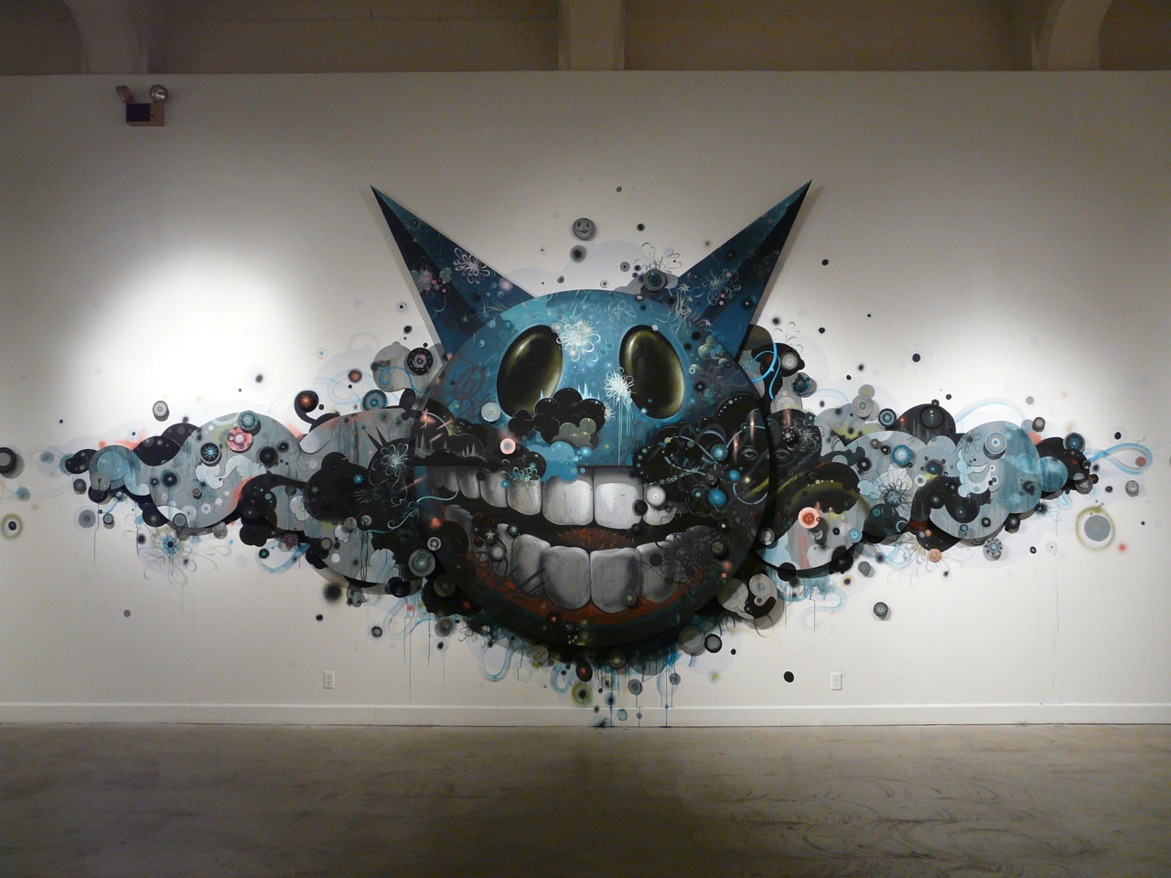
This peice is fantastic because though the outline is simplistic the interior is very detailed. The detail on the head alone is really good. The shading in both the eyes and teeth make them look more realistic even though the head is cleary not anything you would see in everyday life. The cloud like design around the head i think really makes the piece and the detail and line work is excellent. I also love that through out the piece they're are eye's everywhere but unless you really look you don't see them. The drip effect through the piece is one of my favourite parts as i love this effect and think that when used in the right context and the right style can really make a design look amazing.

http://www.123klan.com/upload/image-11122008131758.jpg
The things i find great about this piece is that it takes the typical skeleton figure but puts its own twist on it, like the little images and patterns all over the skull. I like the blend of colours which is odd because orange and green arn't typically colours i would think would work well together. The little bits of detailed art like around the nose and eyes plus the cracks on the fingers look good and i love how realistic the bullet holes in the head look. I think that the white outline around the skeleton sets it out and give it that little bit extra.

Sunday, February 8, 2009

david choe

http://www.davidchoe.com/

I found this website on the qnb site and loved it. i think this guys work is amazing and was instantly drawn in. The design of the page is nothing special but is simplistic and easy to use. I think it suits the artist though because alot of his art is done using simple things (like the sculptures) but are done in an amazing way.

Saturday, September 13, 2008


this here is a pic i drew i've my little brother in the same style that i did my neices in previous blogs.


This is my new and improved mag spread. I feel like it's a pretty good job, i've learnt alot about designing and i've been looking at other designs and trying to get ideas. I've learnt about spacing and making it all level! I don't think i'd change anything but i'm sure there is probably alot that i should!.