http://hydro74.com/
The reasons i like this design is because of it's use of light and dark. I think it blends the two together really well and by using the light in certain parts make those elements( such as the skull and typography) stand out. I like the use of colour also i think that purple and black look really good together. The mirror and smoke effect also look really cool and give the peice some umf!. I think it's put together really well not overly cluttered yet not to bare.
http://www.davidchoe.com/mixed/pages/speakeazy.html
This is a mixed media peice from David Choe. One of the things i love about this piece and all David Choe's mixed media is that he blends all the mediums so well you can hardly even tell that its a mixed media piece. I love the use of vibrant colours for the backdrop and the way he mixes dull washed out colours in the face in some places achieving a stained or aging effect. I also like the glowing shadow of the face i think it really helps the head to stand out on the background and makes it seem to come forward which is a contradiction to the rule as generally the cold colours will go to the back and the warm forward but he manages to reverse this and i thinks thats pretty cool.
http://www.sebastianonufszak.com/feature056.html
I like this piece for both its asthetic appearance and the message behind it. I love the way the designer has composited all these things into one and has the stretchy flow coming out of the can. The blend of colours used works well because they compliment each other and don't clash which is always important when designing something. I also love the effect of the various images sprouting out mixed between the drink contained in the can. The message free your mind is a favourite of mine because i feel like its good advice and that a free mind is the best kind. Getting your message across in your work is an important part of design and i feel that this piece does it really well.
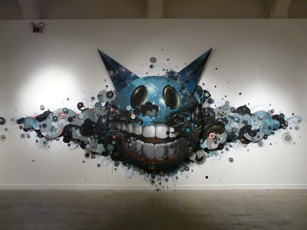
http://arrestedmotion.com/wp-content/uploads/2008/12/p1020107.jpg
This peice is fantastic because though the outline is simplistic the interior is very detailed. The detail on the head alone is really good. The shading in both the eyes and teeth make them look more realistic even though the head is cleary not anything you would see in everyday life. The cloud like design around the head i think really makes the piece and the detail and line work is excellent. I also love that through out the piece they're are eye's everywhere but unless you really look you don't see them. The drip effect through the piece is one of my favourite parts as i love this effect and think that when used in the right context and the right style can really make a design look amazing.
http://www.123klan.com/upload/image-11122008131758.jpg
The things i find great about this piece is that it takes the typical skeleton figure but puts its own twist on it, like the little images and patterns all over the skull. I like the blend of colours which is odd because orange and green arn't typically colours i would think would work well together. The little bits of detailed art like around the nose and eyes plus the cracks on the fingers look good and i love how realistic the bullet holes in the head look. I think that the white outline around the skeleton sets it out and give it that little bit extra.
Subscribe to:
Post Comments (Atom)
No comments:
Post a Comment